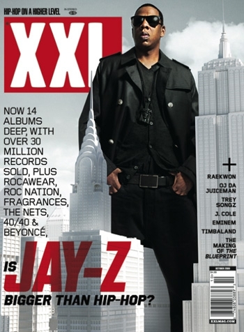
 The second magazine cover I will be evaluating is “XXL” published by Harris Publications. To start off with the main image on the cover is Jay-Z a famous rap artist this suggest the target market for the magazine is young people because he produces music to suit their taste. The image of Jay-Z has been purposely juxtaposed big onto the cover because it gives the impression that he is superior to Hip-hop therefore putting empathy on that he is also bigger than New York City as that is the capital of Hip-hop, so him being bigger than New York means nothing can get bigger than that. The front cover also point out that the main story would be about him, the magazine cover also relates to one of Jay-Z songs. Jay-Z posture also empathies on the fact that he is great because he stands with pride with his hands in his waist and facial expression stern.
The colours used in this cover is simple but effective as the background only consist of grey allowing all the other colours to stand out and the word “Jay-Z” is in red which catches audience more than different colour because it may get too confusing to read. The background also relates to his album cover. The text is all uppercase lettering in order for audience to be able to read with ease. The text on the left shows off all of Jay-Z achievement revelling to us why he is better than Hip-Hop, the way in which the text is written we can interpret the tone as a commentator would say it allowing the audience to feel like they are being spoken too. The text includes devices such as alliteration “Hip-hop on a higher level” this makes it more memorable for the audiences. The magazine sell lines consists of other artists that feature in that weeks addition of the magazine, this gives the audience an insight into the genre of music the magazine has available and it also a promotional method as they put well known artists in order to attract customers as they well established customers are interested.The fact that the magazine has available an XXL website this means their audiences are usually website users therefore they have a website provided for them, also showing synergy through the use of internet promotion.
 This magazine also consists of the same genre as the one above however different company. The magazine “Vibe” was launched by Quincy Jones, its cover consists of a main image, a master head, cover line and a main cover line. The photograph on the front initiates that this magazine targets young people ageing from 15-20 and music lovers as the iconography image of “Lil Wayne” suggests this as most young people listen to his music.
The male artist Lil Wayne is seen as a major rap artist in this image his states is empathised with the use of the throne on the front cover and him sitting with his feet on the chair this is seen as a subvert to what thrones are usually used for this shows his immaturity and his act of not following tradition, suggesting he is different.
The title of the magazine is usually big and bright, this type of font is used on other magazines i.e. NME suggesting that magazines with large title are more appealing for audiences. Vibes front cover usually uses famous artist in order to gain audience interest the artist are usually Hip-hop or R’n’B artist this enhances it recognition as we can then immediately notice what genre of music it specialises in and what the magazine main story would be about, Vibe uses this as a promotional method as they know customers would be interested in famous rappers such as Lil Wayne’s story, it also teases the customers as it gives them a taste of what to expect in the magazine. Surrounding the artist are headlines about other artist that people would also be interested in, this is also another way to help promote as people are always interested in famous people lives.
From looking at other magazines I have realised that most magazines stick to a limited amount of colours as shown in this cover this could mean that they don’t want to over do it as if too much is happening on the front cover then it maybe hard to read and colours may clash, therefore complementary colours such as blue, yellow and orange help to make the cover stand out and more readable.
_____________________________________________________________
Preliminary Task
_______________________________________________________________________________
Preliminary Task Photo Ideas


 The magazine I will be evaluating is “Q” found by Mark Ellen and David Hepworth. The name “Q” is abbreviated for the word “cue”. Situated on the left side of the magazine is an award making it clear to customers to customers they are one of the best magazines, this can cause purchasing rates to increase as they know they will get their money worth if bought. The magazine looks formal and mature maybe targeting audience ranging from 20-30 judging from the artists they feature in as the image on the front of take that would be more appealing to older age range instead of younger.


